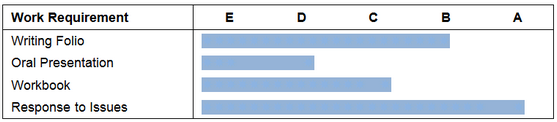
Rather than present results as text in student reports, you may present them graphically. For example, instead of showing an A to E score besides a series of assessment tasks, you may wish to indicate the student's result by a shaded continuum, as shown here.
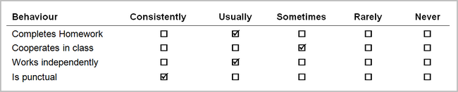
Or perhaps you may wish to display the results using a series of tick boxes, as displayed in the example below.
In addition, a school may want to display graphs that show an individual's results, and/or those of the whole class or subject. For example, the distribution of students’ achievements in a particular assessment item across the whole subject could be represented in a line graph, as shown here.
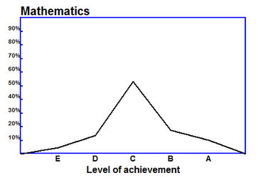
The above examples use two different methods to display results graphically in Accelerus:
| • | Via graphical marking schemes, used in the first two of the above examples. |
These are set up in the Marking Schemes window.
| • | Using graphic functions. |
In this case, calculation formulae are defined in an XML file, which is imported into a school's Accelerus database. Such a graphic function has been used in the third examples above.